Before and after: How to improve your purchase confirmation email
By Sandy

I’m in a total Property Brothers binge watching phase. Maybe it’s because I’m getting ready to move, and I’m spending (way too much) time dreaming about my new space.
But there’s something I’ve noticed that happens on that show that also happens to a lot of your customers as soon as they make their initial purchase.
Let me explain:
On Property Brothers, the hosts convince home buyers to commit to a renovation. They bring them to a ton of houses, all of which are pretty trashed on the inside.
But the curb appeal is usually pretty nice (I’m guessing because it would cost way too much to redo the outside AND the inside of a house).
Looking at just the outside, it’s easy to assume the inside is also pretty. But that’s never the case.
The buyers walk in, and their face drops. They’re disappointed.
Then, the brothers fix up the house and everyone lives happily ever after.
Your prospect shows up on your website. Everything looks good. They pick out a product (either digital or physical), enter in their card info, and make the purchase.
Or… they don’t make the purchase. But they do sign up to get your awesome freebie.
They’re happy. They’re smiling. They can’t wait to get their hands on that “thing” you just promised! Then… they’re met with an old, boring, not-yet-renovated email.
Cue frowny face. 🙁
I see this all the time! You guys… you’re using the before email! You need to renovate that thing to make it pretty… it needs to fit your brand.
Most shopping carts and email service providers come with emails already in place. There’s a “confirm your request for info” email, a “your item shipped” email, an “order confirmation” email… all the emails you need.
It’s great that the technology is available, and you should be sending out these types of emails, but you can’t leave them looking like a “before.”
Why? These emails are the first pieces of communication that a customer or prospect receives from you. It’s the first time they get to see what it’s like once they step inside your house.
Sure, everything looks pretty on the outside… but how are you treating your guests behind closed doors?
Today, I’m going to renovate a standard email so you can see what I’m talking about. Hopefully, when you see these emails side by side, you’ll get a feel for what you can do to spice up your own email autoresponders.
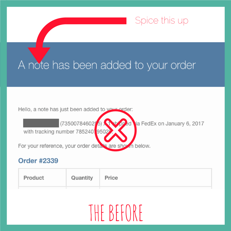
I received this email after making an online purchase. Pretty boring, right?
Sure, I got the info I needed. But this email does nothing to further my relationship with this company.
But even more dangerous, this after purchase email is missing out on a huge opportunity… and it has nothing to do with making any additional sales…
This email doesn’t do anything to reduce the rate of returns.
Making a purchase is typically an emotional decision, right up to the point that the money is spent and the sale is confirmed.
When that happens, all of our doubts and fears start to creep in. It’s not fun anymore. The fun part has past. Now, we’re just left paying the bill.
As a seller, you should take every opportunity possible to keep the good feelings going. This is when the customer will start to reason through the purchase, thinking of all the reasons they’ve just made a mistake.
In other words, you shouldn’t give up on overcoming objections just yet.
To do this, consider adding a testimonial. Or, a stat that brags about how great your product works. Or, maybe just a picture of that beautiful box that’s going to arrive at their doorstep. Or, just let them know someone cares and you’re there for them.
Anything you can do to keep momentum going is key right now. Be creative.
I’ve taken the above email and rewritten it to make it a little more appealing for the receiver.
(A little context: This is a device to help monitor levels of ketones in your body. Their competition measures blood and urine. This one measures breathe.).
Good news! Your Ketonix USB has shipped!
In just a few days, you’ll have the power to monitor what is happening inside your body every time you eat a keto diet. Our product is the easiest on the market – no pricking your finger, no expensive test strips, and no peeing on your hand (there, we said it).
Just simple monitoring, day and night.
Your shipping details are below. In the meantime, if you have any questions or would like to speak with one of our Ketonix representatives, give us a call. We’re happy to help you on your keto journey.
Happy keto-ing,
The Ketonix Team
The best part about this email is that you only have to write it once. It took me less than 5 minutes to create that email – that’s it! And it’ll be sent to all of your customers in the future.
Although you won’t see a direct return on investment for this email, you’re building brand loyalty. You’re reducing return rates. And you’re increasing the chances of getting reviews and additional sales later on down the road.
And honestly… 5 minutes. Even if you prevent one person from hitting cancel on their order, that’s worth it.
Your challenge: Take a few minutes to upgrade one of your automatic emails that your new customers receive. It’s worth it! And your customers will smile 🙂
I want to hear from you – which company has the best autoresponder you’ve ever seen? Does it make you smile? Laugh? Did it give lots of info? I want to hear in the comments below.